
CMU SCS '26.5
The UI is so clean… Whoever made this review system, Bravo
I’m a new freshman at CMU, and I cannot believe how goated this website is.
The new update makes it so easy to use! I love the schedule and menu idea! It looks so much better now, thank you guys so much for making this amazing website!!! :)
CMU Eats is a dining info site built with TypeScript, React, and Elysia and used by thousands of students every week. (Frontend repo, backend repo) We get 400k+ page views every year, and, if you ask any student on campus, it’s likely that they will have at least heard about, if not recently used, CMU Eats.
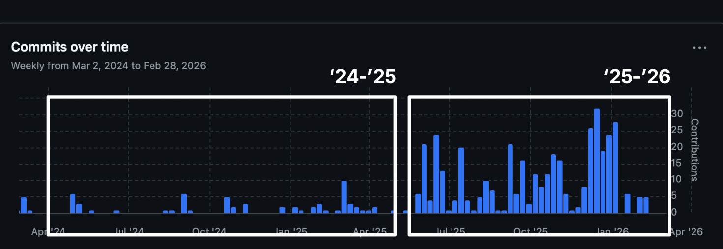
I became a co-tech lead for CMU Eats with Laasya Aki in my junior year, wanting to do more for the site and for ScottyLabs, the student club it belonged to. I improved data accuracy and code quality, added a review system, and redesigned the UI for a more intuitive mobile and desktop experience. As a nice side-effect, I’ve also matured as a programmer, learning what works and what doesn’t to keep prod stable, ship features, and lead a team.
Why does this project even exist?
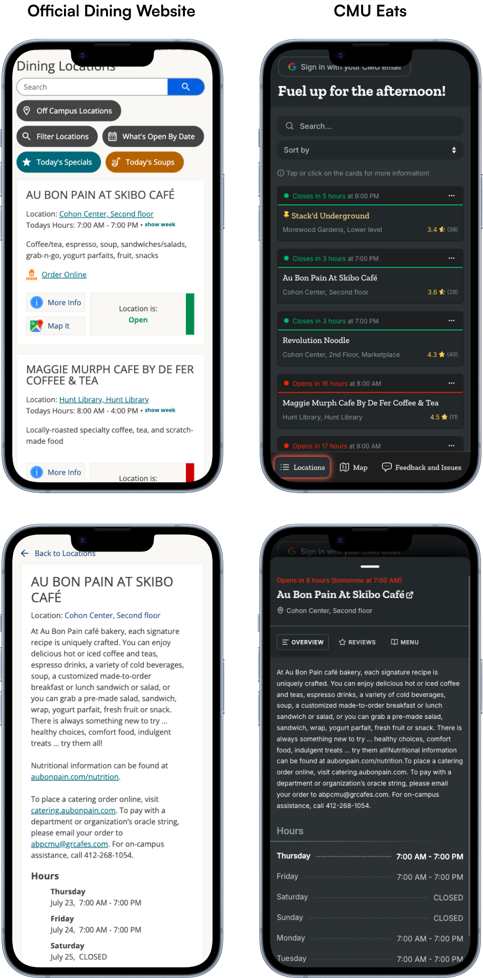
Does CMU not have an official dining website? They do! In fact, most of our data comes from scraping their site with fetch requests. (I’m thankful that their site is SSR’d, for the most part). Surprisingly though, most students still choose CMU Eats for checking dining info. I wasn’t here when this project started in 2013 as a HackCMU submission, but I believe that its success and popularity today come from prioritizing a good user experience above all else. Just look at the mobile layout for both, screenshotted in July of 2026: Same information, wildly different UI/UX.
When I began as co-tech lead, though, this was what we had at the time:
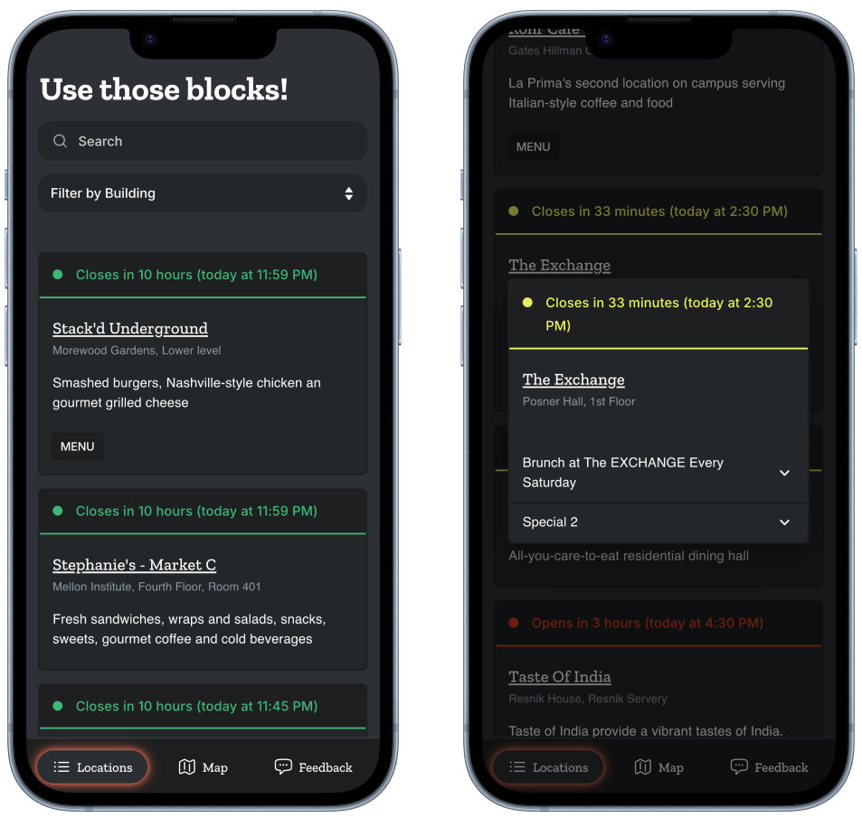
With each card taking up 30% of the screen, it took a good half minute to even scroll to the bottom of the page. This alone significantly reduced usability for mobile users, which, according to PostHog, accounted for 70%+ of our traffic. It also wasn’t obvious where in the UI we could add new features. We did have a bare-bones popup that would show a location’s specials for the day, but it definitely wasn’t going to scale accommodate full menus, dietary restriction information, a review system, and the many other features that we had on the roadmap. We were going to have to do a significant redesign before building anything more on top.
A New Design for CMU Eats, circa 2025
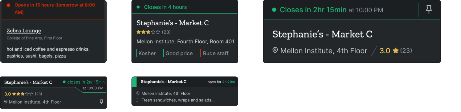
Design is as much about what you leave off the screen as what you put on. The main restaurant cards are a good example. To streamline the primary use case of checking what was currently open, I redesigned the cards to be compact and glanceable, relying as much on color as I did on text to convey the necessary information. When we eventually started bringing in auxiliary features, I made it a point that anything we added shouldn’t degrade the usability of this core user flow.
Based partly on informal user surveys, but mostly on the intuition gained from being a CMU student of 2 years at the time, I kept only the restaurant name, current status, and location info on every card. The description could go, because most students already knew the restaurants by name. The star rating, I thought, could also go, but we added it back later when we realized that it dramatically increased the usage of our new rating system. (We thought a sticky banner plastered on the top of the screen was enough for feature discoverability, but it was far less effective.) All additional data and card actions (pinning, reporting wrong information, etc.) were viewable on card tap or through a dropdown menu. Here were a few iterations I did of the card design, both layout and content-wise:
Implementing the review system
The team was split on how we should design the review system. I thought a simple star rating + written review combination would do, as is implemented on Google Maps, Yelp, Apple’s App Store, Amazon, and a dozen other sites, but other members argued that written reviews alone were inherently flawed: 1) They introduced unnecessary bias that would reduce rating quality, since only those with strong opinions would take the time to write a review, and 2) As CMU Eats had a good few affiliations with official CMU admin, we might end up having to do the extra work of moderating reviews for anything inappropriate. To mitigate both issues, as per one suggestion, users should only be able to upvote and downvote tags (food quality, staff/service, etc.) on each location. Based on these concerns and ideas, I drafted some additional designs:
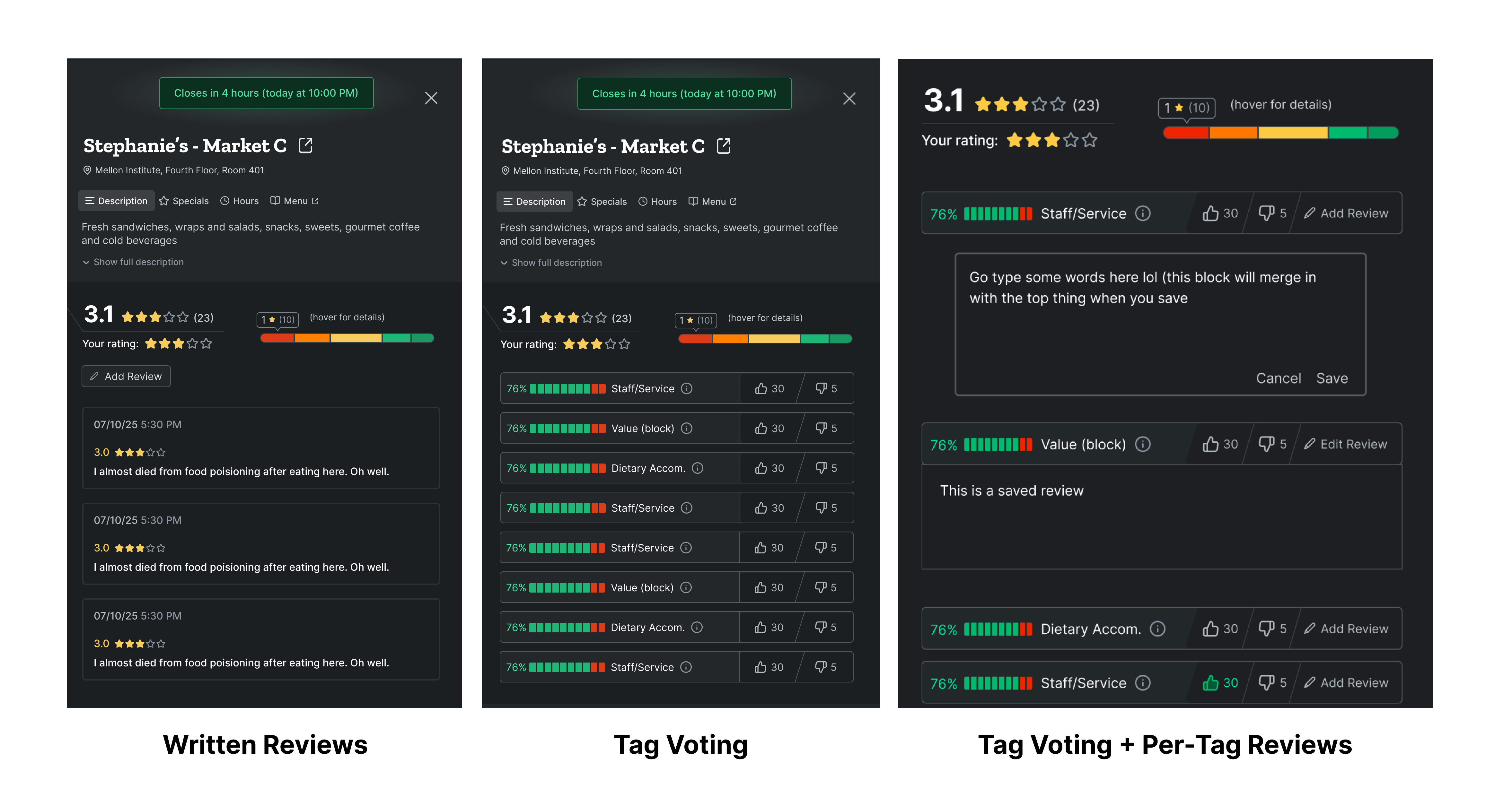
The design on the right is a compromise between the first two, where users could vote on the tags and then optionally leave more details about their vote. There were also a couple additional spinoffs from these main ones, including leaving a written review on the restaurant and then optionally adding tags to said review.
Each type of review system also came with a lot of design decisions. If we were going to go with a tag-based approach, how would we make it intuitive to add, edit, and scan existing reviews? There weren’t too many online references to go off of, and so I threw around a few more designs and discussed them with the rest of my team.
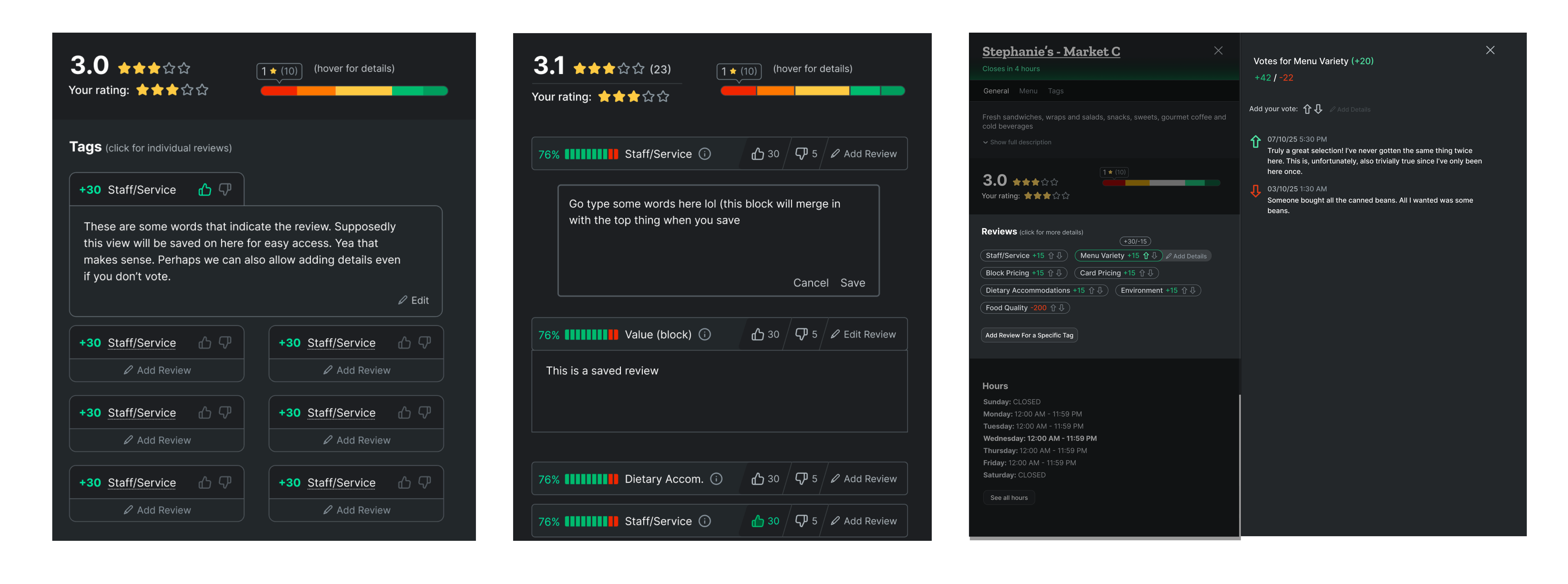
Even deciding the tags themselves led to significant debate. Should they be crowdsourced? Hardcoded in the database? Should tags be downvotable, or should we have a corresponding positive and negative tag for every relevant category? What if someone wanted to vote neutral for a specific tag?
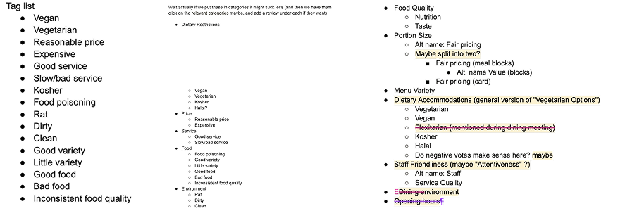
How did we make the final decision for each of the cases above, adequately balancing the tradeoffs and tensions between moderation and expressive reviews, between what was informative for visitors and what was intuitive for reviewers, between sophistication and ease of implementation? We didn’t. At least, not really.
I regret to say that we took rather long in the planning phase, filling up the #cmueats Slack channel with far more lines than we eventually did in our codebase. This was partly because I didn’t want to leave anyone feeling like their opinion was being ignored, partly because I never set any real deadlines, partly because I didn’t realize the existence of lo-fi designing at the time, so every single prototype in Figma was done in high-fidelity. (Also, being a stubborn perfectionist, I iterated so many times in Figma I accidentally hit its max width limit.) A lot of our discussions had also devolved into unproductive clairvoyant predictions instead of being grounded in past experience. We did try to get some real information during the planning phase - we ran some polls, both in the ScottyLabs Slack and in CMU’s student Discord - but you can only do so much by asking people about how they would use different types of hypothetical review systems.
In the end, reluctant to hammer down a decision, I even prepared a tiered implementation plan to incorporate everyone’s opinions:
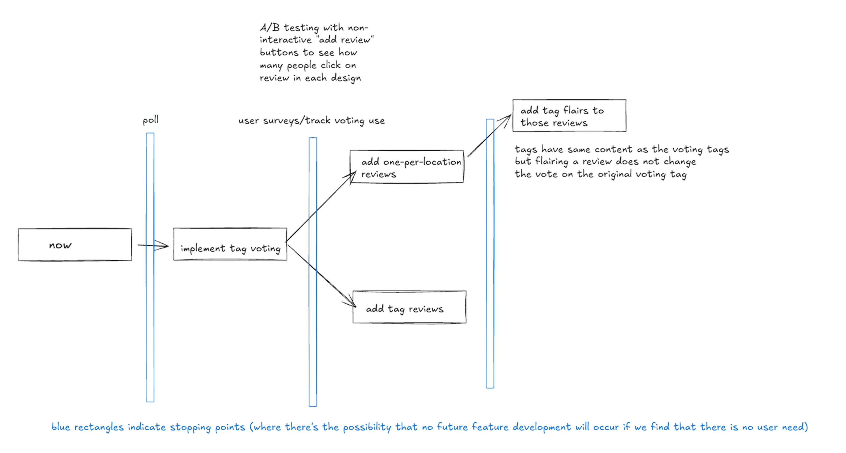
Unfortunately, exhausted from all this planning, we didn’t actually implement anything related to the review system for months. At that point, I threw my hands up, said screw it, wrote a final RFC taking the most promising bits and pieces of our discussion so far, scrapping the original 3-tier plan, and gave teammates a few days to review. The plan was deemed good enough, so I implemented it over winter break.
What were my final choices? For the appeal of novelty and the promise of fairer reviews, I went with tag voting on a sensible list of hardcoded tags. Although users could also add written reviews to each tag vote, there was really no need to moderate any of the written reviews - forcing students to log in with their CMU accounts seemed to be enough of a deterrent for posting anything indecorous. The feature was well received: By just the turn of the semester, CMU Eats had received 630+ star reviews and 2,420+ tag votes, evenly distributed across the 30+ locations on campus.
Yes, they do say measure twice, cut once. But not measure 57 times and then take a 3-month break because you got tired.
What I’ve learned as a tech lead
It’s as much of a tech lead’s job to develop the team as it is to develop the project. I handed off the more well-scoped tasks to my team and reviewed most of their PRs, teaching good coding practices and praising well-written code along the way. I had them implement significant pieces in the mobile/desktop redesign and add new features like pinning and hiding cards, a feedback form integration with our Slack channel, a sponsor carousel, keyboard shortcuts, etc. I would be remiss not to credit the team here, many of whom became great friends along the way: Laasya, Jaisal, Jack, Chloe, Stanley, Mark, Sami, Michael, and Soham. Apart from the basics of respecting and valuing my teammates’ contributions, I found that having a staging environment and a solid set of documentation greatly increased team productivity.
A staging environment is important. We have one at staging.cmueats.com (and its corresponding backend at api.staging.cmueats.com). This is psychologically beneficial, in that you feel more comfortable merging in less-than-perfect PRs, knowing that there are opportunities for revision before it hits prod. I am often way too nitpicky with my code reviews, and having a staging branch definitely reduces the number of comments I send before approving. A staging environment is end-user beneficial, because you can do internal testing on a production-like deployment without actually affecting production. Sounds like common sense, really. But to the best of my knowledge, CMU Eats was honestly one of the few projects in ScottyLabs to actually have a staging environment in the big 2025.
Documentation is even more important. You know how much documentation there was for CMU Eats when I began as tech lead? None. Nada. Yes, most of the code was reverse-engineerable, but the reasoning behind the implementation was lost forever. It’s difficult to grow a project effectively without knowing where it came from, and why it is set up the way it is. (Some nasty bugs could’ve also been fixed a lot more easily with just a few pointers.) At some point during the school year, I decided that we weren’t going to continue making future developers suffer from our lack of due-diligence, and I made it a point to ensure that every significant decision or codebase refactor was added into our documentation as an RFC. Every significant bug fix, edge case, or postmortem was also documented. I’ve even written a whole separate post on ScottyLabs and documentation in an effort to get other tech teams on board with better documentation.
CMU Eats is part of ScottyLabs
Among the other pieces of vital information that you should know about CMU Eats, this project is a part of ScottyLabs, the student org/club/now-startup-incubator-that-has-actually-somehow-raised-a-lot-of-VC-money for software development. There are six or seven committees depending on who you ask, and last year, the tech and design committee leadership really wanted to migrate all existing tech projects (CMU Courses, Eats, Maps, etc.) to a standardized design system made by the Head of Design. In other words, a complete reversal of established CMU Eats branding in favor of the nascent “ScottyLabs” look.
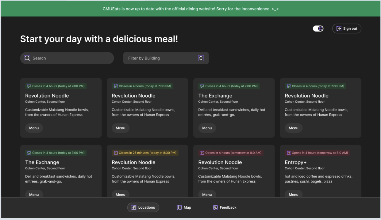
While it wasn’t a bad design all things considered, I refused, stating that the redesign was going to involve significant effort with no substantial visual improvement and a far less flexible interface. The rest of my team was also on board with the refusal, but we were in the minority as far as Tech was concerned, and it definitely did look rather selfish to be the only team refusing to do something for the collective good of the organization. (Fast forward 12 months, and the push for a standardized design system had stalled out, leaving CMU Eats, ironically, the only project with a finished redesign. Just not the standardized one.)
There was also a push from the Head of DevOps to use ScottyLabs’ own self-hosted identity provider (IDP) solution to authenticate users across all of the tech projects. Its main selling point is its native connection with CMU’s SAML Shibboleth infrastructure, which provided information like graduation year and current majors. CMU Eats pushed back on this as well. We didn’t foresee the need for student-specific details, and I wasn’t comfortable with how quickly the underlying auth infrastructure changed month to month. It was Clerk one month. Then Authentik. Then Keycloak. And then it was back to Authentik? Even the weather in Pittsburgh doesn’t change that fast. Instead, I decided to go for the tried-and-true truism of just doing the simplest thing and connected CMU Eats with Google’s OIDC (also technically OAuth) provider. Just a hundred lines of authorization code exchange in our backend, and we had a robust authentication solution for our review system. (We could even bypass the Google account picker screen and force a redirect to CMU’s login page, making it look just as native as the self-hosted option!)
Community Impact
CMU Eats continues to be many students’ first destination for getting the current status of campus dining. I dare say it’s as much ingrained in collective CMU culture as Kiltie Band or Spring Carnival are, just that we don’t steal from your student activity fees. It’s especially heartwarming, while drowning in a never-ending deluge of midterms and homework and TAing, to wake up to compliments and praise from our feedback form.
We also had fun along the way, occasionally changing the heading text and the site theme to reflect holidays or special events, like Miku Day (3/9), Valentine’s Day, or April Fools’ Day, in that order of priority, of course. (You can blame CMU culture for that.)
We also serve everything in our database through a public API that other tech projects, like CMU Maps, Dalmatian (a Discord bot for the CMU server), and CMU GPT, can use. Externally, mellons.app uses our API as well! CMU Eats also meets monthly with CMU’s Dining Services to discuss project direction and to see if they need anything from us, and we have an ongoing partnership with the Dining Student Advisory Committee (DSAC) as well, coordinated on our side by Laasya.
The Future
It’s both scary and liberating to realize that the progress of CMU Eats rests entirely on how motivated the current year’s tech leads are to bring their vision to life. Shipping is difficult! It’s not an overstatement to say that we’ve done a lot this year. It’s also not an overstatement to say that it took a lot of deliberate effort, often at times when the easiest action was to postpone development. Getting from 1 to 100 is just as important as, if not harder than, getting from 0 to 1. Honestly, the more time I spend at ScottyLabs, the more true this quote feels:
The most common error I see is to assume that shipping is easy. The default state of a project is to not ship: to be delayed indefinitely, cancelled, or to go out half-baked and burst into flames.
CMU Eats just happened to be one of the luckier projects in that regard.
If you’re a motivated university student who wants to set the future direction of CMU Eats, feel free to reach out! To see where we’re going and where we’ve been, check out our Notion page. This should be publicly accessible. If it’s not, please let me know and I’ll pester the dev team to open it back up.